vrijdag 19 november 2010

Experiencing trouble sending gifts...

Ravenwood Fair Looks like some of you may be experiencing troubles sending gifts to your friends after clicking on "get help" feed stories. We are aware of the issue and we are planning to release changes that will help you with that tomorrow. Among other things you will be able to send gifts back to your friends easily with one clic...k!


the Ravenwood Fair Team
Lolapps, Inc.
http://apps.facebook.com/ravenwoodfair

('Like' Ravenwood Fair to stay informed with updates like this one!)


Fair examples...

Show and Tell Tuesday! Check out these submissions from the community. Looks like some experts are on the case of Fair building!


the Ravenwood Fair Team
Lolapps, Inc.
...http://apps.facebook.com/ravenwoodfair

('Like' Ravenwood Fair to stay informed with updates like this one!)


Full Screen...

By popular demand, full screen is here! In your settings menu, one little click will expand your Ravenwood Fair experience to fill the entirety of your computer's visual real estate (and more??). Enjoy!


the Ravenwood Fair Team
Lolapps, Inc.
...http://apps.facebook.com/ravenwoodfair

('Like' Ravenwood Fair to stay informed with updates like this one!)


zaterdag 13 november 2010

Thanksgiving...

Ravenwood Fair Thanksgiving is just around the corner (sorry, Canada, we know you already had yours! no hard feelings?) and fall is in the air. Say goodbye to Halloween and hello to Turkey Day! Buildings, games, decorations, materials, and quests shall be yours to behold! Loosen up those belts and get ready for a visual feast


the ...Ravenwood Fair Team
Lolapps, Inc.

http://apps.facebook.com/ravenwoodfair


Halloween's ending...

Ravenwood Fair Halloween is coming to a close this afternoon. Get your building, game, costume, and decoration purchases out of the way today! Halloween dropped items will no longer be coming from the trees to make room for Thanksgiving drops. Don't worry though! If you've got any Halloween related that you'd still like to finish, yo...u'll be able to just fine.


the Ravenwood Fair Team
Lolapps, Inc.

http://apps.facebook.com/ravenwoodfair


donderdag 11 november 2010

How to post your request link on the group page

1. Go to your profile page

2. Search for the Ravenwood Fair gift request post that you want...


3. See the yellow colored "Help Me" ?

4. Right click that with your mouse and select from the little pop-up menu "Copy" (Copy link or something like that)
(For those who don't know right click mouse ------>Your mouse has 2 buttons, left and right, click right to g to little pop-up menu)

5. Paste your link in the group 
(Right click mouse--->little pop-up menu--->select paste)

That's all
Grtz Desie :o)

woensdag 10 november 2010

Calendar for your blog

If you want a calender for your blog like the one second from the top of the right sidebar (position may change as I add or take away Page Elements) of Technology Articles, this is how you can do it.

Go go Plain Calendars, chose the calendar you like (note that at the top of the page, there are other categories of calendars, so if you don't like the example calendar I chosed, you can always go for a different one). Below the example of the calender is a box containing the script to display the calendar. Click on the inside of the box and press ctrl+A (or right-click on your mouse and select "select all") to highlight all the script, click ctrl+C (or right-click on your mouse and select "copy") to copy the script into clipboard, and I think it is advisable to open a Notepad file and paste the script into Notepad (probably best to do it twice so you have an original and you have one you can edit. The calendar I selected for the above post has the script

<!-- FREE-BLOG-CONTENT.com -->
<div style="text-align:center;"><iframe src="http://www.free-blog-content.com/Calendars/calendar00411.htm" width="120" height="150"
marginwidth="0" marginheight="0" frameborder="no" scrolling=no allowtransparency="true"></iframe></div>
<div style="text-align:center;><a style="font-size: 3mm" href="http://www.free-blog-content.com/">Free Blog Content</a></div>

Note that the width and height of the calendar is 120 and 150 respectively (highlighted in red above). The width of the sidebar of Natural Remedies is 150 pixels, so I would like to change its width to 148 pixels. (To learn how to find the width of your blog sidebar, refer to How to find the width of your blog Header, sidebars, main column (click BACK button to get back to this page). I opened Irfanview (click BACK button to get back to this page). I then click IMAGE > CREATE NEW (EMPTY) IMAGE from the menu bar at the top and then input the image width=120 and image height=150. Click OK and a new empty image will be created. I then click IMAGE > RESIZE/RESAMPLE and then keeping the "Preserve aspect ratio" ticked, I edited the width to 148 and the height automatically changed to 185 to keep the aspect ratio constant (that is, the calendar will not be distorted). With the edited script, I then sign into Blogger (Dashboard) and click LAYOUT for the relevant blog from the list of blogs. I click ADD A PAGE ELEMENT in the left sidebar and selected HTML/Javascript. I pasted the edited script for the calendar into the box and click "Save changes" and a new HTML/Javascript Page Element appear at the top of the left sidebar of the LAYOUT. I drag and drop the new HTML/Javascript Page Element to the second from the bottom of the left sidebar, then click "Save" at the top right of the LAYOUT. The result is as you see it.

I originally wanted to demonstrate this in the blog Computers, Internet and Search Engine Optimization (SEO) but found out that the blog uses a fluid width sidebar (which means the width of the sidebar changes with the screen resolution of the visitor. This complicates matter because I will then have to size the calendar to the smallest screen (resolution) to avoid problems. I have a way of doing it, but I think I will leave that for another post.

Uploading animated .gif image to Blogger post

I tested uploading animated .gif image to Blogger post at Testing uploading animated .gif image to Blogger.

Conclusion of the test is, if you upload the animated image direct via the Blogger photo upload icon Google Blogger photo upload icon, the image will no longer be animated as you can see from the first image which was uploaded via the via the Blogger photo upload icon Google Blogger photo upload icon in the toolbar of the Blogger post editor.

If you want the image to remain animated, you must first host the animated .gif image with the free Photobucket image host and use HTML to display the animated image. Here is a screenshot of the animated .gif image uploaded to Photobucket (click on screenshot to enlarge):

Update: According to error7zero, "you can uploaded your (animated gif) files to Google Sites. Apparently, it is also easier to track.


IMPORTANT NOTE: In the screenshot above, I have highlighted the third tag wrongly. You can use it directly, but the image will link to Photobucket homepage, and not to your image or any other sites you want the image to link to. Further, the alt="some description" attribute describe Photobucket". It is the second tag (URL) that you should use for use in your profile, typing your own <img src="image URL" alt="" /> to display the image or to use the image as a hyperlink to another site, eg, your book you are trying to sell on Amazon, etc. However, if you are not familiar with using the <img> tag to display images, the third tag (highlighted) you can just copy and paste into your Blogger post editor window to display the image, and if you wish, edit the target URL to link to any site of your choice and edit the alt="" attribute to some description of your image. The HTML have already been prepared for you and you don't need to know any HTML

For blogging purposes, only the second and third box is relevant. The IMG code (one of the BBB code normally only used in bulletin boards) where you can just copy-paste the IMG code into a message and post in a bulletin board to display the image.

For displaying animated .gif images, you MUST use the EDIT HTML mode for your post editor, otherwise you will not be able to write HTML properly.

Typing the image HTML tag yourself

As you can from the screenshots, the free Photobucket image host give you 4 codes. The second one is the actual URL and if you are familiar with HTML for displaying images, you can type the HTML yourself. It will be of the form

<img scr="photo URL" alt="some text" title="some text" /">

Replace 'photo URL' with the actual URL of the photo which you can get by clicking on the second box (Direct Link) you see in the screenshot above and pressing ctrl+C key or right-click on your mouse and select "copy", then pasting it within the quotation marks in scr="photo URL" and deleting 'photo URL' (that is, in short, replacing 'photo URL' with the actual URL of the photo).

The attribute alt="some text" and title="some text", where you replace "some text" with something relevant to the photo, and are optional. That is, you can leave it out if you want. But it is highly recommended to add them as search engines spiders cannot read images, but can read what is written inside the alt="" and title="" attributes. Adding them will thus enable search engines spider your post better. Further, by adding the title="" attribute, when you hover your mouse cursor over the image, you will see a tool tip displaying the text you put between the quotation marks.

Copy image HTML tag from Photobucket and pasting it into the post

If you are lazy to do what is described above, you can just click on the third box (HTML tag) which for the image used in Testing uploading animated .gif image to Blogger, is:

<:a href="http://photobucket.com" target="_blank"><:img src="http://img.photobucket.com/albums/v336/cikgu/starandbird.gif" border="0" alt="Photo Sharing and Video Hosting at Photobucket"><:/a>

Note that it is given as a hyperlink (starting with <a....), and anyone clicking on the image will be taken to the Photobucket site, not to the page showing the photo. Further, the alt="" text is given as alt="Photo Sharing and Video Hosting at Photobucket" which means you are doing a favor for Photobucket. Well, if you are generous, that is a fair exchange for Photobucket hosting the photo free for you. Plus you have the luxury of just copy-pasting. Also, the animated image will be aligned left.

Copying the image HTML tag from Photobucket and editing it

Another alternative will involve a little extra work but will get the displayed and at the same time do what you want. If you want the animated image to link to a site of your own choosing, you can delete http://photobucket.com and replace it with a URL of the site you want to link to (the actual image on the web, your favorite site, you homepage, etc.). If you are observant, you will notice that the example of the image HTML tag obtained direct from Photobucket end with

alt="Photo Sharing and Video Hosting at Photobucket">

whereas mine ends with

alt="some text" alt="some text" /"

(note: for Photobucket, no space between title=""> and no / for HTML tag. This is bad practice because to be compliant with XHTML, a HTML tag with opening tag and no closing tag (most HTML tags come in pairs, and opening tag and a closing tag. Only very few HTML tags like the img tag don't need closing tag) should end with a / plus there must be a space between the last attribute and the /. I suppose if you want to comply, you can just edit the HTML from Photobucket yourself.

Further, the image is aligned left. What I did in Testing uploading animated .gif image to Blogger was to copy the photo HTML direct from the third box (HTML tag) and as I don't want it linked to Photobucket, I deleted the

<:a href="http://photobucket.com" target="_blank">

in front of the <:img...... and then deleted <:/a> at the back of the tag, leaving the image HTML tag as

<img src="http://img.photobucket.com/albums/v336/cikgu/starandbird.gif" border="0" alt="Photo Sharing and Video Hosting at Photobucket" title="animated gif image"/>

leaving the alt="" attribute as alt="Photo Sharing and Video Hosting at Photobucket" as a favor returned for Photobucket hosting the image for me free, adding title="animated gif image" but adding a space after the title="" tag followed by a backslash / to make it XHTML compliant.

In the third test image, I wanted to center the image, so I surrounded the above edited image HTML with <div style="text-align:center"> and </div> (note: this is the standard tag with an opening tag and a closing tag) so that the image HTML become:

<div style="text-align:center"><img src="http://img.photobucket.com/albums/v336/cikgu/starandbird.gif" border="0" alt="Photo Sharing and Video Hosting at Photobucket" title="animated gif image" /></div>

Thumbnails using LinkWithin

Displaying links to "related posts" beneath individual entries on our blogs is a tried and trusted method of providing useful and interesting reading material for our readers.

I've written about several different methods which Blogger users can choose to display related posts - all of which perform their function well enough. But after seeing several of my favourite sites displaying links to related items with thumbnails using LinkWithin's free service, I was intrigued to discover how well this may be adapted for use with Blogger.


About LinkWithin

LinkWithin is a free service offered by a small team based in New York. This free service enables us to display related posts with thumbnails below our blog posts (the thumbnail is taken from an image within the post it links to).


We retrieve and index all stories from your blog archive, not just recent stories, making them accessible to new or casual readers of your blog who would not otherwise encounter them.

The posts chosen to appear as related posts are based on several factors including:
  • Relevance
  • Popularity
  • Recency
At present, LinkWithin is not ad-supported and is completely free to use.  As explained on the FAQ page:


We plan to introduce revenue-sharing features in the future, but they will be optional.

At present, there is little documentation for us to be certain of these factors, though after testing LinkWithin in a few different sites, I'm pretty impressed by the choices generated for each post!

Here is an example of how LinkWithin functions for WeLoveBlogger.com:


Why LinkWithin may be a more ideal solution than other related posts solutions for Blogger

The "related posts" solutions for Blogger which I've used until now have all relied on label feeds. That is, the recent posts generated by such scripts collect recent posts from the same label (category). This often means that posts deeper within our archives are generally ignored, even when they may be far more relevant than the more recent posts displayed.

LinkWithin parses all posts from our blogs, and chooses the posts to be displayed using more complex and relevant factors. This ensures far greater relevancy which is better for our readers and also ensures that older posts are included in the display.

How to add LinkWithin Related Posts to Your Blogger Blog

If you're using a standard, uncustomized Blogger template, the method for installing LinkWithin is fairly straightforward. Simply visit the LinkWithin website, fill in the form on the right-hand side (choosing Blogger as your platform) and follow the instructions provided.

This will install the related posts in your template as a gadget beneath the main posts section, though you'll find the "You may like these related stories" section will be displayed beneath each of your blog posts (before the post-footer section). It will also display on each and every page of your blog, including the main, archive and search pages.

Custom Installation of LinkWithin for Blogger templates

If you prefer to display your related posts only on item pages or have a customized, non-standard Blogger template, here is how you can install LinkWithin:
  1. Visit the LinkWithin website and fill in the form on the right-hand side. For the "platform" be sure to choose "Other":


On the next page, you will find a script like this is generated. From this code, you need to write down your unique "site ID" for later use (or copy this to your favourite text editor):


  1. Once you have a note of your Site ID, go to Layout>Edit HTML in your Blogger dashboard and ensure you have checked the "Expand widget templates" box.
  2. Using your browser's search function, locate this tag (or similar) in your Blogger template code: <div class='post-footer'>

    Depending on the template you are using, this tag may vary slightly though you should usually be able to locate 'post-footer' in your template code.
  3. Immediately before this line, paste the following section of code, replacing "YOUR_SITE_ID" with the ID number you have noted down for your site:
<b:if cond='data:blog.pageType == "item"'>
<script>
var linkwithin_site_id = YOUR_SITE_ID;
(function () {
var elem = document.createElement('script');
elem.type = 'text/javascript';
elem.src = 'http://www.linkwithin.com/widget.js?rand=' + Math.random();
document.getElementsByTagName('head')[0].appendChild(elem);
})();
</script>
<a href="http://www.linkwithin.com/"><img src="http://www.linkwithin.com/pixel.png" alt="Blog Widget by LinkWithin" style="border: 0" /></a>
</b:if>


  1. Preview the changes you have made before saving your template. The LinkWithin gadget should not display in the preview; furthermore, if there are any errors in the installation you will be able to see before attempting to save.
  2. If all is well, save your template and visit an item page in your blog: you should be able to see related posts showing up beneath your blog posts.

Support for LinkWithin's related posts

While I can help with installation for LinkWithin in Blogger templates, I'm not able to help with specific problems with the script.

Luckily, the LinkWithin team offer a good support service via email:

If your blog uses a non-standard custom template/theme, we will need to add support for your blog manually, and we can do this only if the widget remains installed on your blog. Please email us at support AT linkwithin DOT com, and we will fix the problem, usually within 1-2 days. Thank you for your patience!

At the moment, it appears we can only display three related posts. Hopefully LinkWithin will offer the option to display more (or less) items in a future version of the script.

Why I'm not using LinkWithin yet...

LinkWithin is a very useful solution for Blogger users wishing to display links to related posts in their blog. I recommend this service and will be using this in a future release of Blogger Buster.

My current template is highly complex and has served me well for many months. However, there are several new (and upcoming) customizations and new features for Blogger which may not work so well in this design. I'll explain more about this in a future post when the site changes are closer to completion.

    How to Add a Featured Content Section on your Blog's Home Page

    One of the customizations I use most when designing Blogger templates is creating a "featured content" section to be displayed only on the home page. I often use this technique to display a content slider, mini-portfolio or slideshow above the main posts section.

    Take a look at the home page of my site, Just Great Film, to see an example of this in action (click on images for full screen previews):

    https://blogger.googleusercontent.com/img/b/R29vZ2xl/AVvXsEg24soMD9_l6NdXrnS476C25sZipxu44bMDqjhwu2SSFYiWSKiVfHTI6fPrQSJXt7ckGtLJn4m6qIYzp1mjTpmTDCNJiZzJHG_i9bsy_BJyCkJ1SET6P4yk2EVecphGjTzKYMS38Yv6sbcY/s1600/just-great-film-home.png

    https://blogger.googleusercontent.com/img/b/R29vZ2xl/AVvXsEideFAdvOdZ-2E_N_bP-ttKDadG0ou6Q4bOnMKQ2NzrtzlXZHQm4jjVuvLltRhzJddbZVqYz-C1O7w_nPm0If2KVvgzXwYEv5XyTXb51wLNbjFKGGgpqodu8jpWXFd-9hPyd_ykbkgsyEg2/s1600/just-great-film-item.png

    Here's an easy way to restrict the display of a gadget to your blog's home page.


    Back-up your existing template

    Before making any changes to the HTML code of your Blogger template, it's advisable to make a backup of your existing, working template code, just in case you make a mistake when editing or accidentally save unwanted changes!

    To make a back-up of your Blogger template, simply go to Layout>Edit HTML in your Blogger dashboard and click the "Download full template" link near the top of the page.

    This will prompt you to save your existing template file as an .XML document to your computer, which you could later upload if you need to restore your theme.

    About "Conditional" Tags

    "Conditional" template tags enable us to dictate the type of page in which the enclosed content can be displayed.

    In this example, we are restricting the display to the home page only, and will be using the following syntax:


    <b:if cond='"data:blog.url==data:blog.homepageUrl"'>
    <--Content to be displayed on home page appears here -->
    </b:if>

    Anything which appears between the <b:if> tags will be displayed only on the home page. We can add any HTML content between these tags, including Blogger template tags.

    If you're confident editing the template code of your blog, you can adapt the code snippet to suit your requirements. Or read on for the simplest way to add this function to your template.


    The simplest way to add a featured content section on your blog's home page

    If you're using Blogger's new template editor (the new format for Blogger templates) you can add a featured content section in a few simple steps:
    Go to Layout>Edit HTML and locate the following section of code:

    <div class='region-inner tabs-inner'>
    <b:section class='tabs' id='crosscol' maxwidgets='1' showaddelement='yes'>
    <b:widget id='Text2' locked='false' title='Some Title' type='Text'/>
    </b:section>
    <b:section class='tabs' id='crosscol-overflow' showaddelement='no'/>
    </div>

    Depending on whether you have installed a Page Links (or other) gadget, you may also see other gadgets housed within this sectionAdd the following lines (highlighted in red) to this section of your template code:

    <div class='region-inner tabs-inner'>
    <b:section class='tabs' id='crosscol' maxwidgets='1' showaddelement='yes'>
    <b:widget id='Text2' locked='false' title='Some Title' type='Text'/>
    </b:section>
    <b:section class='tabs' id='crosscol-overflow' showaddelement='no'/>
    <b:if cond='data:blog.url == data:blog.homepageUrl'>
    <b:section class='tabs' id='crosscol-homepage' showaddelement='yes'>
    <b:widget id='HTML1' locked='false' title='Add title if you want to' type='HTML'/>
    </b:section>
    </b:if>
    </div>

    1. This will add an additional gadget section (beneath your tabbed page navigation, if present) in which you can add home-page-only content via the Page Elements section of your dashboard.

      I've added a placeholder gadget in this code so you can easily identify the section when editing your gadgets in the Page Elements section of your dashboard.
    2. Now preview your template: if all goes well, you should see your gadget appear in place above the posts without error and can proceed to save your template.
    In order to add a gadget which only appears on the home page, go to Layout>Page Elements and edit the gadget titled "Home Page Gadget" which will appear above your blog posts. Alternatively, delete this gadget and add a new gadget as per your own requirements.


    The easy way to make a great blog header!

    In yesterday's post, I wrote about what makes a great blog header. As I'm sure many of you will agree, a great blog header doesn't only include your blog's title and logo. Visitors need to know what your blog is about (branding) and how easily they will be able to find the information they need (navigation, and possibly search elements).So in this installment of the blogger template design series, I'm going to show you a quick and easy way for you to add more than just your header image to your Blogger blog: adding extra sections for widgets, in which you can place anything you want!
    If you take a look at the Blogger Template Design blog now, you'll see the bare bones of a header beginning to take shape. The title and description for this blog are now featured in the left-hand section, while on the right you can find a search box, and a simple navigation bar:


    The search box and navigation links are actually widgets which can be edited through the layouts section, rather than being built into the template itself. This is by far the easiest way to change elements of the header section, and it's really easy to install this in your own blog template!

    How to add more elements to your header section

    In this tutorial, there are only three essential steps needed to add these extra elements to your own blog:
    1. Copy and paste a section of code in the header section of the template.
    2. Add some styling code to the CSS portion of the template
    3. And finally...
    4. Add some widgets to your newly created widget sections!
    Trust me when I tell you that this is a really easy hack. You can be up and running with a new, more interactive header in no time at all, and once the basic structure is in place, you can begin styling each section to best suit your needs.

    Step by step instructions

    1. Go to Template>Edit HTML in your Blogger dashboard, and find this section of code:
      <div id='header-wrapper'>
      <b:section class='header' id='header' maxwidgets='1' showaddelement='no'>
      <b:widget id='Header1' locked='true' title='Your blog title will appear here (Header)' type='Header'/>
      </b:section>
      </div>
      Highlight this entire section of code, and replace it with this instead: 
    <div id='header-wrapper'>
    <b:section class='header' id='header' maxwidgets='1' showaddelement='no'>
    <b:widget id='Header1' locked='true' title='Blogger template Design Series (Header)' type='Header'/>
    </b:section>
    <div id='header-right'>
    <b:section class='header' id='header-right-top' showaddelement='yes'>
    </b:section>
    </div>
    <div id='header-right-bottom'>
    <b:section class='header' id='header-right-bottom-section' showaddelement='yes'>
    </b:section>
    </div>
    </div>


    Next we need to change some of the style in the <b:skin> section. So find this entire section of code:

        #header-wrapper {

        border: 1px solid #000000;

        margin:0 auto 10px;

        border:1px solid $bordercolor;

        clear: both;

        word-wrap: break-word;

        overflow: hidden;

        }


        #header-inner {

        background-position: center;

        margin-left: auto;

        margin-right: auto;

        }


        #header {

        margin: 5px;

        border: 1px solid $bordercolor;

        text-align: center;

        color:$pagetitlecolor;

        }

    Note: the code which appears in your own template may have slightly different styling attributes to the example above. The important thing here is to replace the #header-wrapper, #header-inner and #header sections, and add some extra styling code.

    Once you have found this section, highlight it and replace it with the following section of code:

    #header-wrapper {
    width: 950px;
    border: 1px solid #000000;
    margin:0 auto 10px;
    border:1px solid $bordercolor;
    clear: both;
    word-wrap: break-word;
    overflow: hidden;
    }

    #header-inner {
    background-position: center;
    margin-left: auto;
    margin-right: auto;
    }

    #header {
    width: 500px;
    float: left;
    margin: 5px;
    border: 1px solid $bordercolor;
    text-align: center;
    color:$pagetitlecolor;
    }

    #header-right {
    width: 400px;
    float: right;
    border: 1px solid $bordercolor;
    color: $pagetitlecolor;
    margin: 5px;
    }
    #header-right-top {
    padding: 0 5px 10px;
    }

    #header-right-bottom-section {
    padding: 0 5px 10px;
    }

    #header-right ul {
    margin: 0;
    padding: 5px;
    }

    #header-right ul li {
    display: inline;
    padding: 5px;
    }

    #header-right-bottom {
    width: 400px;
    float: right;
    border: 1px solid $bordercolor;
    color: $pagetitlecolor;
    margin: 5px;
    }

    #header-right-bottom ul {
    margin: 0;
    padding: 5px;
    }

    #header-right-bottom ul li {
    display: inline;
    padding: 5px;
    }


       2. Note: if your own blog template is narrower than 950px, you may want to make some alterations to the styling code above. Change the width of the #header-wrapper to match the width of your outer-wrapper, so that it will not disrupt the overall width of your blog. You may also want to lessen the widths of the #header section, and the #header-right and #header-right-bottom sections too.

          If you preview your template you will see that the title and description are now aligned to the left, with space on the right for you to add your new widgets. So save your template, and let's add some widgets to these new sections!
       3. Adding widgets to these new sections is the easiest part of this tutorial. Simply go to Template>Page Elements and add your widgets in the new sections which have appeared beside your header!

          Both of these sections now have styling for list items, so if you want to add a navigation bar, choose to add a "Links List" page element. Add your links as required and save. When you preview your template, you'll see that this display inline (horizontally) rather than in a long list.

          To add a search box to your header, you could either choose to add a Google Custom search widget, or use a simple blog search widget instead.

    Width these extra widget sections in place, there are endless possibilities for what you may add to your header section! I used a search box and navigation links as an example, but you could easily substitute these for a description, feed links or anything else you choose instead.
    Your blog logo/custom header image

    As before, you can still add your custom logo or header image to the header widget. This will be resized to the new width of your header section (in the example above, this is 500px wide), so for best results you should upload an image of the same size.

    If your image is wider than this, you should check the "Shrink to fit" box inside the widget editing box to ensure the header doesn't overshadow the other widgets on the page.

    Create Extra Columns in your Blogger Layout - Magazine Style!

    One of the newest (and popular) trends of blog design is the magazine style layout. As the name suggests, this design style presents content in magazine format where extra columns and content are featured on the home page, offering readers an overview of the entire site.

    At present, Blogger Buster's home page features a magazine style layout. Rather than display a list of recent posts in typical blog style, the home page summarizes the most recent post, followed by links to other articles by category, and additional information about the site.

    Many readers have requested a tutorial to create a similar layout for their own Blogger powered blogs, so in this tutorial I'll explain how you can add extra columns and widget sections on your blog's home page to create a magazine style layout of your own.


    How Magazine Style Layouts Work in Blogger

    In this template (and also in the Blue Steel template), I have added extra widget sections beneath the main posts column. This allows me to add (or change) the content displayed on the home page from the Page Elements section of my dashboard, without having to manually change my template code.

    Also, I have used the b:if function to prevent these widgets from being displayed on post and archive pages (where they are not required).

    To create a magazine style for your own blog, you will need to make two main changes to your template:
    Insert the code required for your new widget sections
    Add relevant styling code to the <b:skin> section of your template to change how these widget sections appear.


    In this tutorial, I will explain the simplest method of creating a magazine style front page. This involves adding two columns for widgets (to appear side by side) beneath the main posts section of your blog. Once you have added these sections, you can add widgets and change the settings for your blog to alter the appearance and overall look for your template.

    Be sure to back up your existing template before making any changes! Then if you change your mind about your design (or make mistakes during the process) you can easily restore your template.

    To make a back-up of your existing template, go to Layout>Edit HTML in your blog's dashboard and click on the "Download full template" link. This will save your template as an XML file to your computer.


    Add new widget sections below your posts

    To add new columns for widgets below your posts, we will need to add some code to the main posts section of your blog.

    Go to Layout>Edit HTML in your blog template, and do not check the "expand widget templates" box. Then search for this section of code in your template:


         <div id='main-wrapper'>
            <b:section class='main' id='main' showaddelement='no'>
    <b:widget id='Blog1' locked='true' title='Blog Posts' type='Blog'/>
    </b:section>
          </div>
    In your own template, this section may look a little different. For example, you may find <div id='main'> or <div id='content'> instead of <div id='main-wrapper'>.

    If you are having problems locating this section, use your browser's search function to locate the phrase "blog posts" or "Blog1", and be aware of the surrounding b:section and div tags.

    Once you have found this section in your template, you will need to copy and paste the following code just after the closing </b:section> tag and before the closing </div>


    <b:if cond='data:blog.url == data:blog.homepageUrl'>
    <b:section class='sidebar' id='magazine-left' showaddelement='yes' >
    <b:widget id='Text51' locked='false' title='Test Title 1' type='Text'/>
    </b:section>

    <b:section class='sidebar' id='magazine-right' showaddelement='yes' >
    <b:widget id='Text52' locked='false' title='Test Title 2' type='Text'/>
    </b:section>

    <div style="clear: both;"></div>
    </b:if>


    By adding this code, we have inserted two extra widget areas which contain a "dummy" text widget so you can preview their appearance. These sections are also contained in <b:if> tags, which determine they are only seen on your blog's home page.

    At this stage, you can preview your template and will see these dummy widgets appear below your posts section. However, as we have not yet styled these sections, they will appear beneath each other rather than side by side.


    Adding style to your new widget sections

    Now that we've added the code required for our new widget sections, we need to add some styling code to ensure they appear side by side.


    For this, locate the closing </b:skin> tag in your blog's template. Just before this tag, you should paste the following section of code:


    #magazine-left {
      width: 45%;
      float: left;
    }
    #magazine-right {
      width: 45%;
      float: right;
    }
    Then preview your template. Now you should see your the titles for the dummy widgets appear side by side with a gap between them. These titles should have similar styling to your sidebar headings and match the overall theme of your template.

    Once you are sure everything looks okay, you can proceed to save your template.

    If you do receive an error when attempting to preview or save these customizations, click the "Clear edits" button and begin adding your code from the beginning, being extra careful when copying and pasting this code.


    Adding widgets and styling your home page

    Now that you have added the required code for your magazine style front page, you may want to remove the dummy text widgets and replace them with your widgets of choice.

    Simply go to Layout>Page elements in your Blogger dashboard, where you will see your new widgets appear below the Blog Posts section like this:


    Click on the edit link for the existing "Test Title 1/2" widgets, and choose to remove these if you prefer. Then add new page elements of your choice to customize the appearance of your blog's home page.

    You may also prefer to limit how many posts are displayed on your blog's home page so that your new widgets will feature higher up on your blog's home page.

    To change the number of posts which are displayed, go to Settings>Formatting and choose the number of posts to display using the first option on this page:


    In many magazine style blogs, only one post is displayed on the home page, but if your posts are short, it should be acceptable to post more than one without affecting the overall look and style of your design.


    More ideas for your magazine style design

    If you want to take your magazine style design a step further, you may also like to check out these tutorials:

    I hope this tutorial has helped explain how to add new widget areas for a magazine-style front page with Blogger. Please feel free to leave your comments and opinions below.

    The following tips and tricks will make it easier to earn money, mushrooms, experience, items, and overall just to have a lot of fun in the game.

    The following tips and tricks will make it easier to earn money, mushrooms, experience, items, and overall just to have a lot of fun in the game.


    EARN PROFITS FASTER

    To earn profits faster and allow your visitors faster access to all of your attractions, move all of your attractions so that they are closer together. You can even do this with attractions that are already built, but that you have to chop down scary trees to access - just chop down the trees, clear the thorns or whatever you have to clear, then when you clear the thorns off, just move the attraction so that it's closer to the center of the fair, where the visitors enter the fair. The smaller the distance your visitors have to walk, the faster they can get to all of the attractions, and thus the more money they can spend.

    More fun = more visitors = more money.

    One of the quickest ways to earn money and experience (and to get a sense of what direction you want to take your fair in) is to concentrate on beating various quests. You'll get huge bonuses for doing quests, and the tasks that you are trying to complete, will help your fair anyways.


    ENERGY AND MONEY

    -Make sure you are using mushrooms to buy energy 20 at a time. The smallest jar is a terrible deal.
    -Use long-lasting protectors like the pumpkin.
    -Try alternating between "chopping days" and "money days." On chopping days, don't bother restocking; just use your energy to chop trees. On restocking days, keep everything loaded and rake in the money, and let your trees regrow.
    -Regularly restock items with 100 uses and high fun ratings; Restock the smaller ones only if you have "extra" energy.
    -Before logging out, restock items that are running low (10 or less uses).
    -When you visit neighbors, chop down their trees to get the food bonuses. WAIT until the items are collected before leaving; if you leave right away you don't seem to get the bonuses.

    DETHORNING ATTRACTIONS IN FAIR

    There is a number of games already built in your fair that can earn you money, but are covered by thorns and hidden by scary trees, so once you chop down the scary trees and make it to the games, you can de-thorn them, and voila, you have yourself a free game. Once you get to level 6, you can de-thorn the 820-fun Whack-A-Bug in the upper right hand area of your fair, so make sure you have a route available to get to that by the time you level up.

    VISITING NEIGHBOURS

    Go visit your neighbors' fairs. You'll get energy boosts and bonus money for doing so (and for responding to their feeds), and you'll earn extra experience points for playing with their attractions. Some of their attractions can be played with without even using any energy points to do so, so play with those.

    CHOPPING TREES

    1.Chopping down trees is an effective way to earn coins, because each time you chop a tree you earn a little bit of coins. The amount ranges from 1-20 per chop, so it can definitely add up to be a substantial amount of dough. You can only chop as long as you have energy though, so this option doesn't work for just anyone.
    2.Chopping down trees in Ravenwood Fair isn't just necessary for clearing out space, but also for gathering necessary materials. Chopping trees will yield wood, money, and experience, and in some instances even extra energy. It's also one of the only ways to gather rare materials like ladybugs and sap, which you'll need to build most of the attractions for your fair.
    3.DON'T CLEAR ALL YOUR TREES. YOU NEED THEM THROUGH THE GAME FOR WOOD ETC. GETTING LOW ON TREES. ONLY CHOP ONCE OR TWICE. LEAVE UNTIL THE NEXT DAY THEN THEY HAVE RECHARGED TO FULL CHOP (4=4 ETC).

    TOO MANY TREES:
    -Protectors that are charged keep roots from growing. Establish a ring of protectors around your main faire area. Make sure their green zones touch or nearly touch.
    -Any item you purchase keeps roots from growing in that spot. Pave your faire with "clean grass" and "dirt paths."

    NOT ENOUGH TREES:
    The one tip I've got is this: Go around and chop each of your trees only 1 time. They'll grow back within 24 hours and you can do it again. It helps if you break your trees into small clumps so you can access most of them instead of having one large bank of forest. They seem to grow back quicker this way than if you chop down the whole tree. It's not much, but it's something.
    Actually - one more thing. Protectors keep the trees from growing back, so shut them off if you're needing more resources!

    VISITORS

    Talk to your visitors when you see them. Sometimes they'll just talk fluff, but it's still entertaining to talk to your visitors, just like talking to the townspeople in an RPG, just to hear what they say. Some of them will even drop inside jokes, like a reference to the millennial fair in Chrono Trigger. Other times, visitors will tell you what they really want to see at the fair (hint hint - use this to figure out what to build at the fair).

    SCARED VISITORS

    1.If you see one of your visitors shaking, click on them. They're scared, and if you click on them and calm them down, they will no longer be scared, and instead be ready to start spending money at the fair again.

    2.Every time one of your visitors is scared of something in the woods, you can click on them to comfort them. Comforting a visitor gives you 10 coins each time you do it. You can also visit your neighbors and comfort the visitors in their fair.

    MUSHROOMS

    Don't be afraid to spend your mushrooms on energy boosters. This is one of the few energy-based games where energy can be bought with a free currency, and you can earn plenty of mushrooms simply from chopping down scary trees. So when you want to splurge on energy, go for it.

    BUILDING

    If you want to figure out what's best to build early on, look at the price of whatever buildings and/or games you can choose from, and compare price to both the fun and profit factors. One of the best things to build is a sweet corn stand. Build a lot of cheap attractions to start off with, and you'll make a lot of money.

    1.Building games is not only one of the main objectives of Ravenwood Fair, it actually has a huge coin benefit to you as well. The more games you have, the more visitors will come to your fair. Visitors spend money playing your games, so you can collect coins from them while they are playing. Clearly, it is a good idea to have as many games as you can afford in your fair. Building games does require you to spend coins though, so it might not be the most cost effective way to earn them.

    2.Games are also a great way to keep your fun levels high, but they also serve another purpose: making you lots of money. As long as you keep your games stocked on a regular basis, they'll yield plenty of cash that you can then invest in further fair improvements. But just make sure to restock them regularly, because otherwise they become useless.

    ENEMIES

    As you clear out the scary forest, you'll come across plenty of evil creatures (like the wooden Domovoi hiding amongst the trees in the image above). It's important to deal with these enemies as soon as possible. Not only can they prevent you from performing actions by stunning you, but they'll also scare your customers. Defeating them also tends to yield fairly high levels of experience points.

    PROTECTORS

    It's tempting to spend all of your money and resources on attractions and decorations, but you should also consider investing in protectors. These objects will help calm down customers who get scared, so you won't have to. Each one only has a limited range, however, so it's best to keep a few scattered across your fair.

    COMPLETING QUEST

    Doing quests is one of the best ways to earn coins in the game. Quest objectives vary from killing Domovois to collecting materials and building games, so there is generally one quest available that you can do without having coins. When you complete a quest, you can earn thousands of coins, not to mention XP and energy as an added bonus.

    GETTING STUFF

    Getting skulls and candy ---->recharge protectors

    Getting crystals-----> smash rocks on your and your neighbours fair


    OTHER USEFULL HINTS !!!

    1.I have found that if you move the protectors around they need re-charging ,when you re-charge you get rewards I have got wedding items,vitalin and sap ..sometimes you only get money and xp but it is a good way to get the extras if you have spare energy

    2.More fun = more visitors = more money

    3.Early in the game when you clear a tree and you don't want another to grow in its place, go into the decorations and lay a path or some other decoration down on your newly cleared spot. This way it will stay clear.

    4.Don't clear out your entire forest, leave a small patch of trees as later in the game you will need wood and when you don't have trees they seem to grow back slower.

    5.If you're having a lot of problems with Domovoi, bears, and grimms showing up constantly, leave them alone and go work in a different area. There have been reports of multiples of these showing up, but usually if you have a couple just hanging out on your farm you won't get more. You can use a protector to corral them into a corner if they're in your way.

    6.Early on in the game, don't build anything without being asked! The game doesn't credit you for things you've already built so don't waste your sap/vitalin etc building unncessary games/buildings.

    7.Don't go crazy with the paths because you dont' want trees to grow. Trees are your only self-controlled source of food and supplies...you need them!

    QUESTIONS & ANSWERS

    WHERE IS THE THORNED WONDERSITE?
    -Its' the very north corner theres a thorned thunderbox its right there...

    What are "fun" points?
    -The fun points get more visitors to your fair. You get them by building


    I have completed my party pantheon and received a prairie party, but not sure what the benefits of it are, should i use it or save it for a while??
    -You will get a prairie party dog every six hours if you click on it so use the one you have if you want.It send prairie dogs all over your fair for the time limit it shows on the screen so you can collect coins

    What is the Prairie party supposed to do when you click it?
    -A troupe of prairie dogs come to your fair and spend money. So it's basically additional guests for about a minute.

    BUILDINGS & GAMES STUFF NEEDED

    TRASHCAP:

    1 VITALIN

    SUPER-DUPER-CART:

    6 BUILDS
    10 WOODS
    2 VITALINS
    4 TREE SAPS

    WHACK-A-BUG:

    2 CRYSTALS
    4 VITALINs
    2 TREE SAPS
    8 LADYBUGS

    DUNK-A-BUG:

    2 VITALINS
    4 LADYBUGS

    COMPLETE THE PARTY PARTENON:

    30 LADYBUG
    40VITALIN
    25 TREE SAP
    25 CRYSTAL


    BUILDING THE WEDDING TOSS
    it takes: 10 times building it
    PLUS:

    35 WEDDING RINGS
    8 WEDDING GIFTS
    21 WEDDING BELLS
    14 WEDDING BOUQUETS

    COMPLETE THE WEDDING CHAPEL

    20 WEDDING BELLS
    25 WEDDING GIFTS
    18 WEDDING BOUQUETS
    10 WEDDING RINGS

    LEVEL 19

    EPIC CHAPEL
    5000 FUN
    25 BUILDS (1 energy, 20 woods)


    70 WEDDING RINGS
    36 WEDDING BOUQUETS
    50 WEDDING GIFTS
    42 WEDDING BELLS

    How to Make an Impressive Blog Layout in Photoshop

    In this easy to follow web design tutorial, you will learn how to construct a beautiful, sleek, and professional-level weblog design using Adobe Photoshop that you can later use for your very own blog theme.
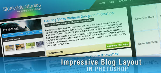
    You can see what we’ll be making. Be sure to click on it to see the full-scale version of the blog layout.


    Setting up the Photoshop document

    1 Create a new Photoshop document, File > New (Ctrl + N), with a canvas dimension of 1024px by 1184px.
    2 Fill your Background layer using Edit > Fill (Shift + F5) with the color #252424.

    Creating the layout’s Header
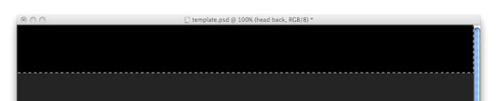
    3 We’re going to create the layout’s Header section first. On a new layer, create a rectangular selection at the top of the canvas using the Rectangular Marquee Tool (M). Use the following figure as a guideline on how to create this selection.
    4 Fill the rectangular selection using Edit > Fill (Shift + F5); use a black fill color #000000.
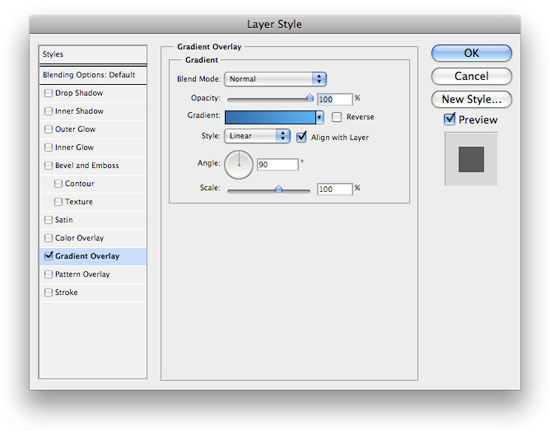
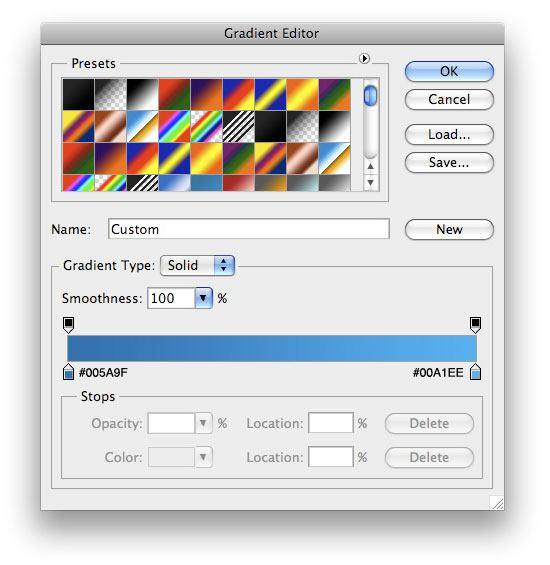
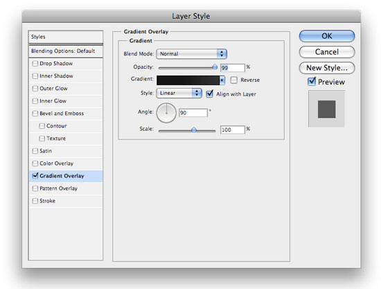
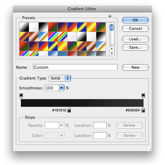
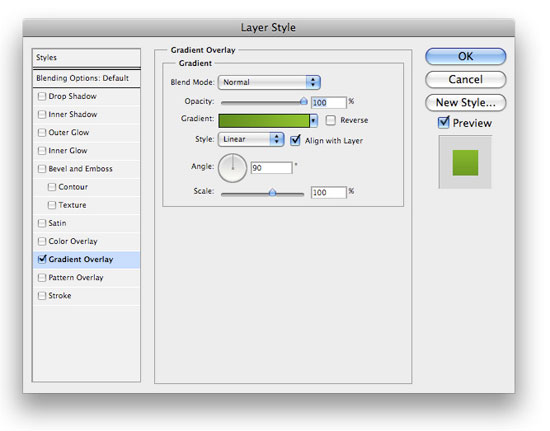
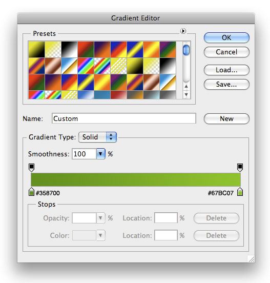
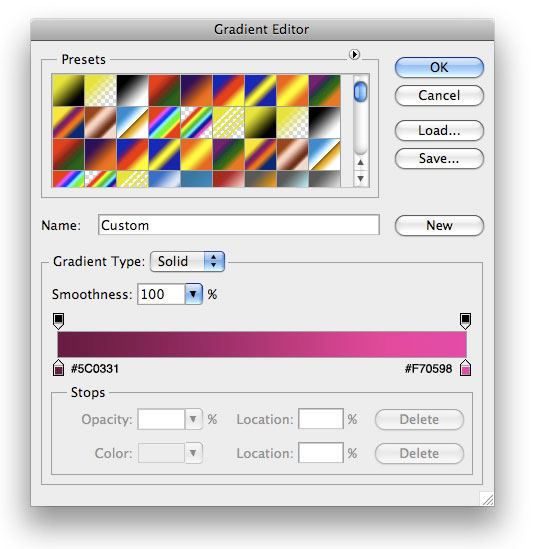
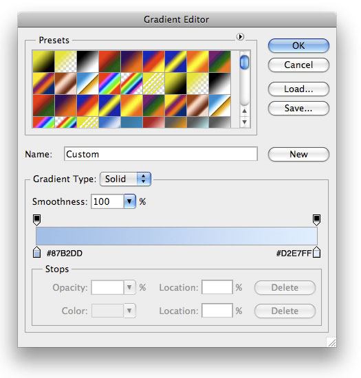
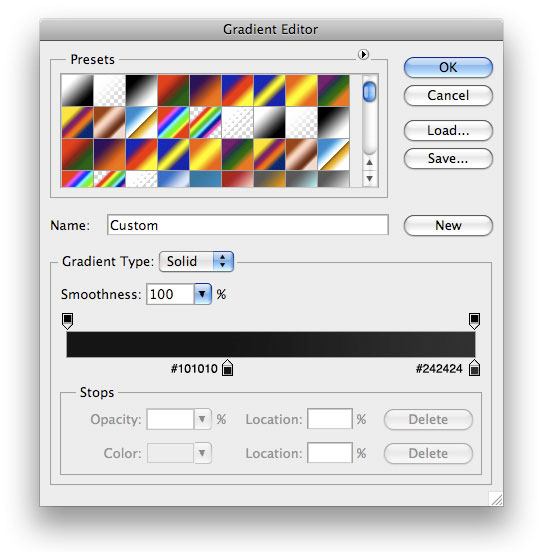
    5 To spice things up a bit, we want to add a Gradient Overlay. Go to your Layers Panel, right-click your newly created layer, choose Blending Options, and Add a Gradient Overlay layer style using the settings below.

    6 Now, we want to work on our navigational menu.  Using your Rectangle Marquee Tool (M) again to make a selection similar to the following figure, and then fill it with white (#FFFFFF).

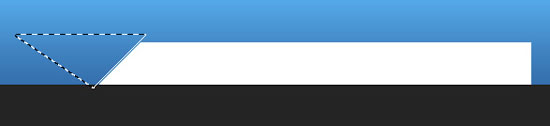
    7 In the Tools Panel, choose the Polygonal Lasso Tool and make a selection similar to the following figure, and then choose Edit > Clear to delete the area beneath the lasso selection.

    8 We don’t just want this to stay white, so let’s add a Gradient Overlay layer style onto this layer.

    9 Next, in the Layers Panel, Ctrl + click on the layer’s thumbnail to make a selection around the navigation menu background. Create a new layer and fill the selection with a white color, #FFFFFF.
    10 While still selected, use your down arrow key to nudge your selection down, and then choose Edit > Clear.  Then, deselect your current selection (Ctrl + D) and nudge your layer down another 1px using the Move Tool (V).  It will look something like this:

    11 Change your layer’s Blending Mode to Soft Light and lower the opacity to 58%. Now, your navigation will look something like the figure below.


    12 All that is left for the navigation is to add some text for links.  I used Helvetica with a white forecolor (#FFFFFF) for all the navigation links. For the "Subscribe RSS" link, I used an orange color (#ED832E).  I then added a nice little feed icon next to it from Feed Icons that you can download and use for free (see the Feed Icon Guidelines on their site for more detail).


    Making the layout’s logo


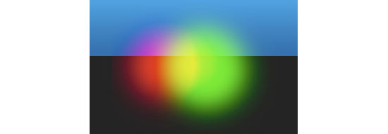
    13 Lets move onto our logo now.  We want to make the glowing colors behind our text first.  Create a new layer and, using your Elliptical Marquee Tool with it’s Feather option set at 18px, make a selection similar to the following and fill it with a pinkish color (#DA4D89).  Change this layer’s Blend Mode to Vivid Light.

    Creating the layout's navigation menu


    14 Create two more layers using the same technique, but change the fill color to green (#06FA05) and yellow (#FEFB03) and Linear Light for their layer blend modes.  As far as layer ordering, make the pink on the bottom, the green in the middle, and the yellow on top and move them around using the Move Tool (V) until you get something like the following figure.


    15 What we want to do now is group our glows together.  Select those three layers, and then hit Ctrl + G to group them into a folder.  Then make a selection similar to the following figure.


    16 With the selection still active, add a layer mask by clicking on the Add a layer mask icon at the bottom of your Layers Panel.


    What you should end up with now is something like this:

    17 Now, we just need to add the text for our logo.  The font I used for the name is InaiMathi, and for the tagline, I used Helvetica Neue (which you can see in action on the Six Revisions logo).  Lay it out something like the following figure.
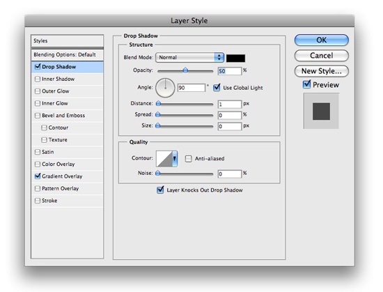
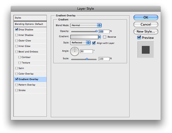
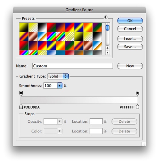
    18 Now, add a Drop Shadow and Gradient Overlay layer style onto your "Sleekside Studio’s" (or whatever site name you used) text layer.


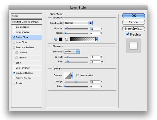
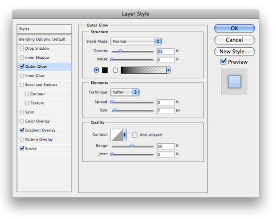
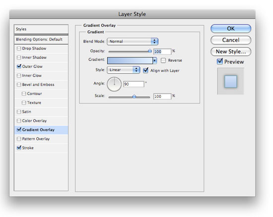
    19 Then, for the tagline, add an Outer Glow and a Gradient Overlay layer style.


    You should now have something like the following image.


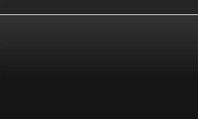
    20 The last thing we need to do to our header is add a little 1px-high shine to the bottom.  Make a 1px-high selection using either the Rectangular Marquee Tool (M) or the Single Row Marquee Tool from the Tools Panel across the bottom of your header and fill it with white.


    21 Lower the opacity of the layer to about 64%, and then change its blend mode to Soft Light. You should now have something like the following figure.


    Working on the blog entry’s design

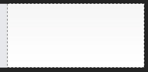
    22 Time to move onto how our posts will be displayed.  Using your Rectangle Marquee Tool (M), make a square selection similar to the following, and on its own layer, fill it with white (#FFFFFF). This will hold the thumbnail images of each blog post entry.
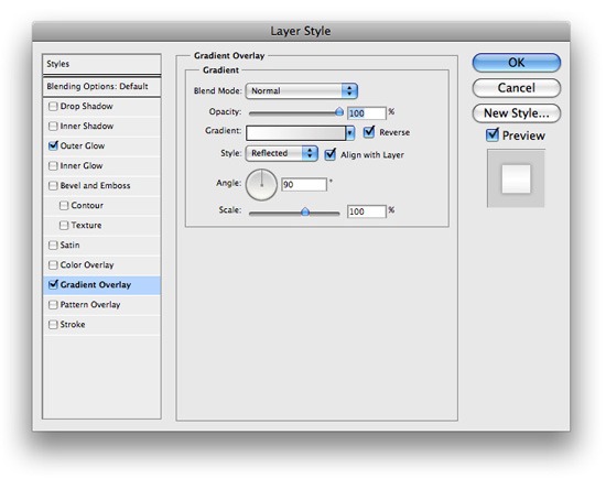
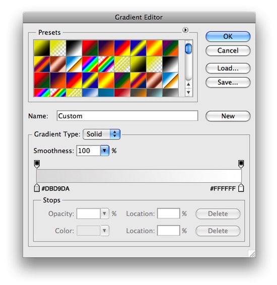
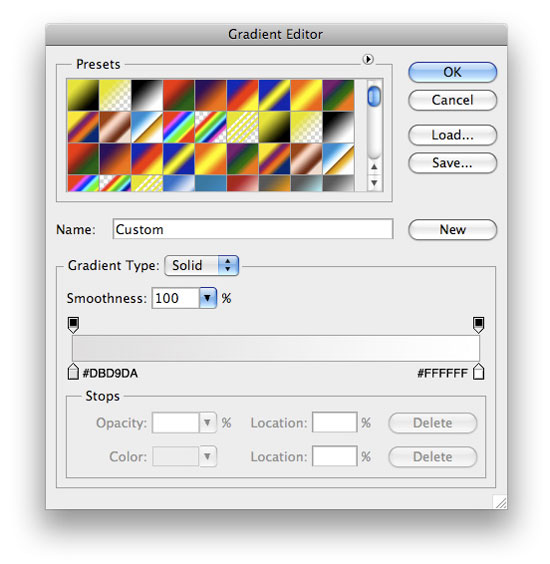
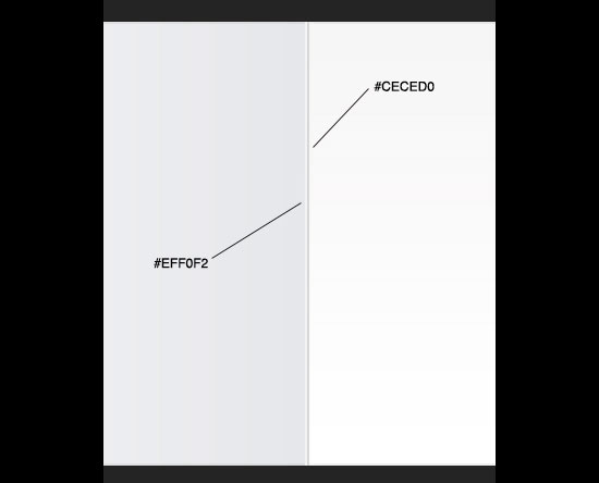
    23 Now insert a Gradient Overlay layer style with the settings below.


    24 Using your Rectangle Marquee Tool again, make a selection beside the thumbnail holder, and on it’s own layer, fill it with white (#FFFFFF). This will contain the blog post entry excerpt text.

    25 Next, we need to make a highlight and a shadow in between the two boxes.  Use the Rectangular Marquee selection and the figure below to make these 1px inset dividers.
    26 Using your Rectangle Marquee Tool again, make a selection similar to the following and fill it with black (#000000).
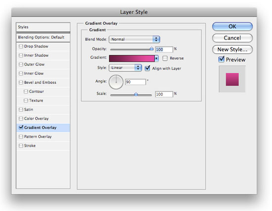
    27 Now, add a Gradient Overlay layer style onto this layer.


    Your blog post entry section should now look like the figure below.

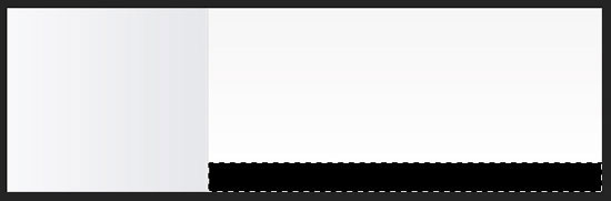
    28 Use the Rectangle Marquee tool again to make a 1px-high selection (create a new layer) at the top of the blog post entry excerpt box you created to make a nice little shine. Lower this layer’s opacity to 29% or so.
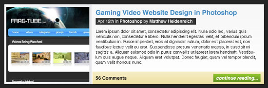
    29 The last thing we need to do for the blog post entry design is to create the button for the ‘continue reading’ link that will lead the users to the full blog post.  Using your Rectangular Marquee Tool (M), make a selection similar to the following and fill it with black (#000000). Use the Horizontal Type Tool (T) to add the text to the canvas using a foreground color of white (#FFFFFF).


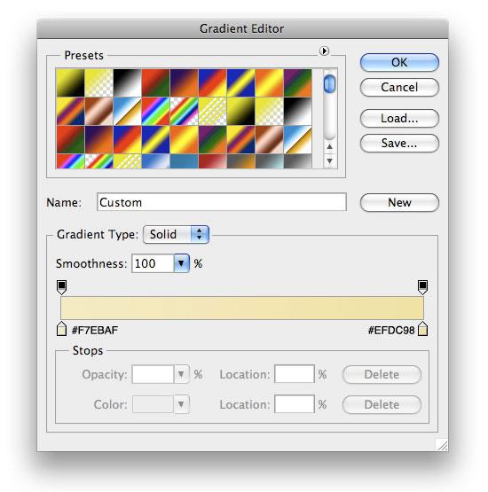
    30 Next, insert a Gradient Overlay layer style to the button’s layer.
    31 Finally, add some content to make your design look like the following figure. Adding sample content will make the mockup look more realistic for when you show it to your client.

    Designing a pagination blog feature

    32 Many weblogs display pagination links at the bottom so that you can easily navigate through older posts. Let’s go ahead and get the simple pagination layout out of the way.  All I did was add some text. For the active page, I used a Gradient Overlay layer style.
    Designing the Sidebar

    33 Time to move onto our sidebar.  Use your Rectangle Marquee Tool to make a selection on the right of the blog post entry area, and fill it with black (#000000).
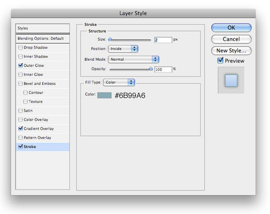
    34 Next, add an Outer Glow, a Gradient Overlay, and a Stroke layer style.


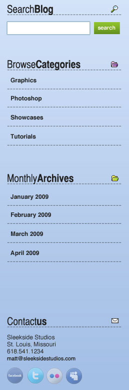
    35 We’ll reserve 125px x 125px ad banners spots at top part of the sidebar design, so want to leave enough space for them.  We also want to add a little search area.  For the headings, I used the font Helvetica CY. I have set the font weight option to Plain for the "Search" text and Bold for the "Blog" text.  For the dotted lines acting as a divider, just use the Horizontal Type Tool (T) with the Color option set to the value of #79818D and then write "———-".

    36 Add some icons beside the headings text.

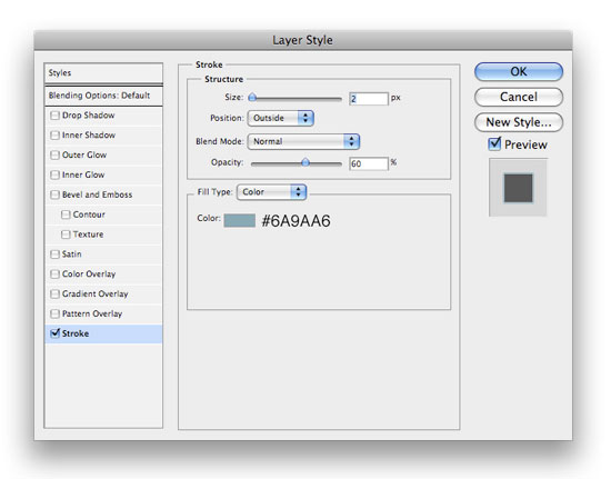
    37 For your Search box, use the same layer style used in Step 30 and add a Stroke layer style with the following settings.


    38 Repeat the above steps to add more sections on the sidebar. Here’s what I ended up with:


    Creating the layout’s Footer section

    39 Now, it’s time for the Footer.  Make sure that the layers of the Footer are all under your sidebar layers. Using your Rectangle Marquee Tool (M), make a selection similar to the following, and fill it with #000000.
    40 Now add a Gradient Overlay layer style onto the layer from above.


    41 Using your Rectangle Marquee again, make a 1px-high selection and fill it with white (#FFFFFF) to make a shine on the top part of your footer.
    42 Lower the opacity of the 1px divider/shine to 24%, and set the layer’s blend mode to Soft Light.  All that is left now is to add some sample content in a similar manner as the sidebar.
    And… you’re done!

    Congratulations, you’ve finished the tutorial. If you followed along, you should have something like the following figure.

    Download the source file

    If you’d like to check your work with mine, you can download the final PSD file below
    (ZIP, 0.97 MB)