As ya’ll may have noticed from my constantly changing blog themes, I’m a background making maniac. Like to hear how I do it?
The Goodies!
I don’t want to do all the work, I just wanna download the background!!
I took one look at the tutorial and there’s no way I’m gonna read all that! Just gimme the template, I’ll figure it out myself!
Now if you’re brave enough…
Stuff to know – This tutorial was written using Photoshop CS3 on Mac OSX. Things might be slightly different if you’re using Windows or a different version of Photoshop, but hopefully you’ll still be able to follow along. ;) Also, any time I refer to shortcuts, I will probably say something like CTRL-C (copy) or CTRL-V (paste). On Mac, use CMD (or the apple key) instead of CTRL. Even though I use a Mac now, I still say CTRL because I am just so used to Windows and I just recently switched. :)
In this tutorial, I use rulers and guides. I just found out that
Photoshop Elements does not support rulers and guides. If you’d still like to try making a background, but don’t have a full copy of Photoshop, I would suggest using
The Gimp.
The Gimp is a free download that is very similar to photoshop. You can use layers, guides and rulers in the Gimp. Setting the guide is a little different, you don’t go to View > New Guide. All you have to do is open up your document, and on the side and top you will see the rulers. Click on the ruler and start dragging over to your document. This will make a guide. You’ll have to manually drag it over until it gets to 400 or 1200 or where ever you want it to go, but at least it works and you’ll have the guides!! :)
I love the Gimp, it’s a great, free alternative to Photoshop. And I love free. :D
But enough about that.
Let’s start making our background!

{ click on any image to see a larger version }
Go to File > New to create a new document and set your width at 1600 pixels and your height at 1100 pixels. Make sure the Background Contents is set to Transparent.
Now before we get started, you probably want to check and make sure your rulers are set to pixels instead of inches. Go to Preferences (on Windows it may be Options?) then Units and Rulers and make sure Rulers is set to pixels.
So, now we have a nice big blank canvas. The first thing we’re going to do is set up some guides for the part that will be behind the actual blog. I like to make this space 800 pixels wide, it’s a good size and works well with most blog themes, especially the Blogger Minima theme.
Go to View > New Guide and enter a vertical guide at 400 px.
Then do that again and set a vertical guide at 1200 px.
This is what it looks like so far…
Now using the Rectangular Marquee Tool, select the entire area inside the new guides you just made.
Right click in the middle of the selection and click on Fill from the menu that pops up.
For the Contents, use White.
Now, if you prefer, you could fill that area with a patterned paper or another color, but I like white. It’s nice and easy on the eyes when reading blogs. :D
But we do need a little decoration for the sides. So let’s open up the yellow damask paper from the kevinandamanda Spring Mini kit.
First thing we need to do is resize it for the web.
Go to Image > Image Size…
…and change the width and height to 1600 pixels. Hit CTRL-A to select the entire yellow damask paper and CTRL-C to copy it. Go over to the blank blog background document and hit CTRL-V to paste the yellow paper.
It will cover up the white background you just made, but if you look over in your Layers palette you should see the yellow layer and the white background layer. Just click and drag the yellow layer to go under the white layer. (if you don’t see the Layers Palette, look up in the menu bar where it says Windows and make sure Layers is checked)
That was fun, let’s do more! :)
Open up the green dots paper from the same kit. This time we’re going to resize it to 1100 px. CTRL-A to select the green paper, CTRL-C to copy, then come over to the blog background. If you look in the layers palette and make sure the yellow layer is selected, when you paste the green paper, it will paste it right on top of the yellow paper, right where we want it to be.
As it is right now, it’s a little too wide. We need to cut some off the sides. You could just take the selection tool and “eyeball it”, that is, select what you wanted to cut off and the hit Delete to delete it. But I’m kind of a party pooper and like things to be exact. And even.
So let’s set up some guides. I love using guides. Go again to View > New Guide and set a guide at 325 and then another one at 1275. For you math majors out there, that’s 75 pixels away from where we did our first guides. 72 pixels looks roughly about 1″ on most screens. In my experience. That was just for free.
So now we have our guides, and we can select the green paper that’s on the outside of the guides and delete it. I love how the selection tool snaps to the guides. If that ever gets annoying, you can easily turn it off and on by going to View and either checking or unchecking where it says Snap.
We can’t stop now, we’re almost done. Let’s put some stripey paper horizontally behind the green paper. And because I like to be all orderly, and exact and type-A, we’ll set up our guides first.
This time, when you’re setting up your guides, make sure Horizontal is checked! Go to View > New Guide and set a horizontal guide at 350 and 750.
So now we have a horizontal bar right in the middle of our blog background that’s 400 pixels tall. Let’s fill it with the stripey damask paper from the Spring kit. Open it up and resize it to 800 pixels wide (and high too, for that matter). Then you know the drill. Select all (CTRL-A) and copy (CTRL-C).
Over on our blog background, make sure the top (white background) layer is selected in your layers palette, then CTRL-V to paste the striped paper. It’ll paste it on top of the white paper (unlike what’s pictured.. Sorry, I must’ve been day dreaming at this point cause the layer order of the papers is a little funky for the next couple of pics, but try and stay with me here). Drag it over to the left, hit CTRL-J to duplicate it, and drag the duplicate over to the right.
Now if you look over in your layers palette, you should see these two layers. I like to go ahead and merge them right now. Makes it easier.
Now that they’re merged, drag that layer under the white background, but over the green paper.
Make sure the striped paper layer is still highlighted, the use the selection tool and select any paper that is outside of the guides. And delete it.
Yay, I finally got my act together and the layers in the right order.
Cool! That’s all for the paper, now for the embellishments…. Let’s open up the light brown stitches from my kit. Yes, were going to resize these too. I use stitches a lot on blog backgrounds, and I always like to set the longest side (in this case, the height) to 1200. Technically, we only need it to be 1100, cause that’s how tall our background is, but I like to give myself a little extra room to work with. And it makes it look like it’s stitched off the page. So that’s kinda cool. :)
So resize, select all, copy and paste the stitches onto our blog background. You’re getting to be a pro at this. Can you recite all the shortcuts for me right now? Oh, and make sure the white paper layer is highlighted when you paste, or else it’ll paste it behind it and then you won’t be able to see it. But if you do that, you could just press CTRL-T and that would select it for you so you could move it. Just in case.
Drag the stitches over to the left side of the green paper. It should snap into place. Arrange the layers in the layers palette so the stitches layer is just above the green paper layer. And below everything else. Hit CTRL-J to duplicate the stitches and drag the duplicate over to the right. Now just for kicks, I always like to hit CTRL-T to select the duplicated stitches, then right click on it and go to Flip Vertical. This just flips the stitches so they don’t look exactly like the ones on the left do. Yeah, I’m a maniac like that.
Look how awesome our background is looking!! Now, I want to add some stitched buttons to the right side of the background. But since I was a loser and only gave ya’ll plain buttons in my kit, I’ll just have to show you how to make your own. You already have all the tools you need right there in the kit.
First, let’s open up the light brown button and resize it a bit… 200 pixels for the width/height.
Now, let’s open up the brown stitches, and grab one… Select a single stitch, and copy and paste it over on the button.
Hit CTRL-T to put a transform box around the stitch. Rotate and resize the stitch until it looks right to you.
After you resize it, click the check mark up in the top tool bar to “set” it. You may need to move it around a bit to get it just right, and you might need to turn off Snap for this. Just go to View > Snap to turn it on and off.
Now. CTRL-A to select the button, but this time, instead of CTRL-C to copy it, we need to go to Edit and click on Copy Merged. This will ensure that we copy both the button and the stitch. But if you don’t believe me, you can do CTRL-C and try to paste it and see what happens. I always forget and do that anyway. Every. Single. Time. But that’s another story for another post!
So copy merged, then paste it onto the blog background.
Even though we resized the button earlier, it’s still too big! hit CTRL-T to bring up the transform box, and look up in the top toolbar. Set the W and H (that’s width and height for the newbies) to 50%. Click the checkmark to the right and that should be juuuust right. Now we need 2 more buttons, so just hit CTRL-J twice and it’ll make 2 more buttons magically appear. Drag and arrange them over on the right side of the blog.
After you get them where you want, you can hit CTRL-T to bring up the transform box and you can rotate the buttons in different directions. Just hold the mouse anywhere outside the box and you should see a funky looking rounded-corner shaped pointer appear. That’s your cue to click and rotate as desired.
Our background is looking awesome! There’s just one more thing I want to do to give it that 3 dimensional look. But first, if those guides are getting in your way, just hit CTRL-; (yes, that’s a semicolon) to hide them. If you want to see the again, just hit CTRL-; again.
So. 3D. In the layers palette, double-click on white background layer. That will bring up the Layer Style box. On the left, click where it says Drop Shadow. Here’s the settings I normally use, but you can play around with them to see what looks best:
Opacity: 25%
Angle: 120
Distance: 0 px
Spread: 0 px
Size: 15 px
If you have a favorite shadow setting you like best, please feel free to share it with me. I’m constantly stressing over realistic drop shadows.
Now, the cool thing is that once you’ve set that drop shadow, you can just right click on that layer in the layers palette and click Copy Layer Style.
Then you can paste it on all the other layers! I pasted it everything except the stitches and the yellow paper.
C’est parfait!!! Now, I like to save one copy with all the layers intact as a PSD file. Just as a template in case I want to do something similar with different papers sometime.
For the web version, I go to File > Save for web and devices and save it as a JPG, quality High.
Now what good is a blog background if you don’t know how to install it? Let’s see if we can do something about that.
First you’ll need to upload your background somewhere, like Photobucket. Even if you don’t make your own and just use mine, please save it and upload it somewhere first and don’t link directly to my background. It’ll use up my bandwidth and make my page slow for everyone and then I may have to spend time figuring out how to block hotlinking when I could be making more totally awesome papers and backgrounds. But enough about that.
Oh one quick thing about Photobucket. When you’re uploading the background, make sure it says something like this:
Cause if it says something like this, it’ll shrink it when it uploads and then it’ll be too small to use.
Install a Scrapbook Blog Background on Blogger:
Go to your Dashboard > Layout > Edit HTML.
Look in alllll that code for something that looks like this (don’t worry, it should be close to the top):
body {
background:$bgcolor;
And change it to something that looks like this:
check it out… here’s what the background looks like on a Blogger blog using the Minima theme.
Install a Scrapbook Blog Background on WordPress:
Ok, now this is going to be hard, because every single WordPress theme is different. And on some of them it may not even work at all. But basically, you’re going to do the same thing. In your WordPress, Dashboard, find your theme editor. Look at the Stylesheet.css file. Look in all that code. Near the top, there should be something like this:
body {
background: some stuff here ;
“background” may not be right underneath where it says body, but hopefully it’ll be close. And it may not even say background at all. If it doesn’t, you can just add it. It’ll be okay. Anyway, whatever it has for background, just delete it. There may even be lots of different things that say background like…
background-color
background-attachment
background-repeat
whatever. Delete it all.
Replace it with this:
Read More http://www.kevinandamanda.com/whatsnew/tutorials/how-to-make-a-scrapbook-blog-background.html#ixzz1MGIgP8Vp.

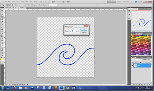 Then fill the selection on your blank layer with a color:
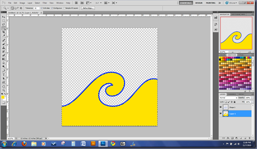 While you still have your marching ants, invert your selection and create another layer above the layer you just filled in and fill it with a different color:
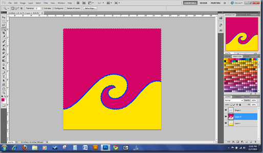 Deselect and you can remove or hide the doodle area if you want, or keep it depending on your taste:
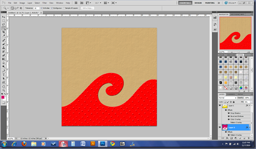
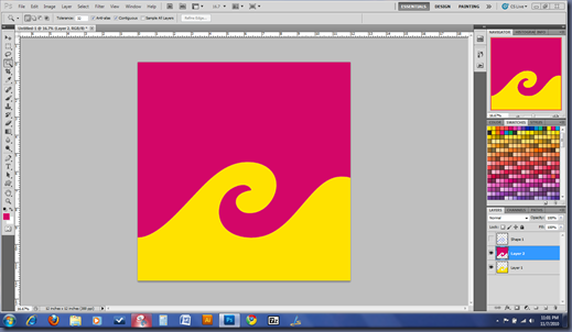 You can clip a background paper to each of the shape layers or just apply a layer style, it’s really up to you!

 Then fill the selection on your blank layer with a color:
 While you still have your marching ants, invert your selection and create another layer above the layer you just filled in and fill it with a different color:
 Deselect and you can remove or hide the doodle area if you want, or keep it depending on your taste:
 You can clip a background paper to each of the shape layers or just apply a layer style, it’s really up to you!